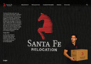
Santa Fe brand April Fools fun
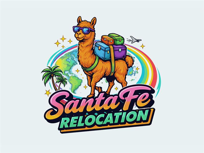
The identity we shared is, of course, an April Fools moment. Our brand remains unchanged, and we take it seriously. It reflects how our customers experience Santa Fe and the role we play in helping people work, live and thrive in new places around the world. That’s what sits behind our brand promise of Global Mobility made easy. While we’re on the subject, it’s a good moment to step back and look at what defines our brand and how it is expressed.
Components
Our brand is built on a defined set of components that shape how Santa Fe looks, feels and communicates. These include colour, typography, grids, imagery and motion. Together, they translate our DNA into practical tools that can be applied consistently across every touchpoint. This consistency strengthens recognition and ensures that everything we create reflects the same level of clarity, quality and intent.
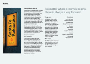
Name
The name Santa Fe was chosen to evoke movement, possibility and connection. It reflects distance travelled, cultures meeting and progress over time. Relocation makes that idea clear and accessible. It speaks directly to the experience of people and organisations in transition. Together, the name expresses our purpose, to move people with care, precision and direction, wherever their journey begins.

Red horse
The red horse is the defining symbol of Santa Fe. It represents energy in motion, focused and purposeful, reflecting the journeys our customers make across time zones and borders. The colour red signals strength, confidence and prosperity. Its abstract form allows it to move across cultures while remaining distinctive and recognisable, providing a consistent marker of who we are.

The horse
The horse reflects progress shaped by awareness, strength sustained over distance and direction held with focus. It represents responsibility in motion, where advancement depends on judgement as much as momentum. For Santa Fe, it symbolises reliability, attentiveness and the ability to respond with control, supporting people across borders with care and accountability at every stage.
Taken together, these elements define how Santa Fe shows up across every interaction. From name to symbol, each part of the identity has been designed to be clear, consistent and recognisable wherever it appears. While the version shared here takes a more playful direction, the principles behind our brand remain the same, grounded in purpose, shaped by experience and reflected in the way we support people and organisations around the world.